The
Elusive P-F Interval
By
Murray Wiseman
Extracted
from Reliability-Centered Knowledge
J. Moubray coined
the phrase "P-F interval". He used it to highlight
two pre-requisites of CBM, namely:
- A clear indicator of decreased
failure resistance - the potential failure, and
- A reasonably
consistent warning period prior to functional failure - the P-F interval
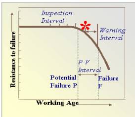
Both these requirements are captured in the well known
empirical graph of failure resistance versus working age (Figure
1).
|
|
The P-F interval
is a deceptively simple idea. Deceptive, because it takes for granted that we
have previously defined "P" (the potential failure). Of the two
concepts, “P” and “P-F”, it is the
former, however, that poses the greater challenge. Therefore, before addressing the P-F interval, we need
to determine when and how to declare a potential failure. Figure 1 implies that if we could monitor a condition indicator that
tracks the resistance to failure, then declaring the potential failure level
would be an easy matter. Two stumbling blocks, unfortunately, arise and
obstruct our plan. The obstacles to the implementation of Figure
1 are:
|
Condition monitoring
data, on the other hand, is abundant. How may we overcome obstacles 1 and 2? That is, how
may we apply CBM to the numerous physical assets where condition monitoring
data abounds, yet, where few alert limits have been defined?
This
(setting of the declaration level of the potential failure) is the problem
encountered by many asset managers deluged with condition monitoring data. The
unavoidable question facing any implementer of a CBM program is where to set
the potential failure. Which indicator, from among many monitored
variables, should he select for this purpose? At what level? When the physics
of the situation are not well known (as is often the case), a “policy” for
declaring a potential failure is far from obvious.
Why does Figure 1 stubbornly elude our grasp? The reason is that this
graph is often not 2-dimensional, but multi-dimensional. There is
one dimension for each significant risk factor. The curve of Figure 1, therefore,
looses its simple geometrical visuality. This is where software comes to the
rescue.
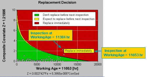
EXAKT
summarizes the risk factors associated with working age and monitored variables
and creates a new kind of graph by transforming the significant risk
information onto a 2-dimensional optimal decision graph. Professor
Dragan Banjevic, CBM Lab director, brilliantly captured the
multi-dimensionality of Figure 1 in two ways. First, he
combined the significant monitored variables (other than age) into a risk-weighted
sum. That became the y-axis. Then he transformed the age-related risk
factor into the shape of the limit boundary. Presto, one 2-dimensional
graph, Figure 2, shows it all.
EXAKT handles the
probabilistic nature of P and the P-F interval rigorously. EXAKT does not assume a
deterministic[1] P or P-F
interval.
|
|
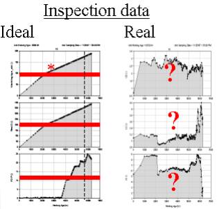
It uses that relationship to estimate the
remaining useful life at any given moment. One of the benefits of this
approach is the ability to deal with noisy data, illustrated in Figure 3. On the left side of Figure 3 are 3 examples of ideal
data. Note how the monitored values increase monotonically, with the red
alarm set conveniently to the potential failure declaration level.
Unfortunately condition monitoring data seldom looks like this. On the right side of Figure 3 is data from the nasty real world. It contains
random fluctuations and trends that contradict one another. In other words,
the usual situation! EXAKT alleviates randomness (see Tutorial 4) and conflicting trend data (see Tutorial 3). The OMDEC team can show you how. |
 .
.
Summarizing, EXAKT overcomes both
obstacles to the application of Figure 1:
- It uncovers the weighted
combination of monitored variables that most truly reflect degraded
failure resistance, and
- It provides a virtual
failure resistance curve that accounts for multiple risk factors.
- It sets the “P”
(potential failure alert limit) dynamically so as to optimize risk.[2]
- It provides a residual
life estimate and optimal recommendaton, based on probabilty and cost.
Do you have any comments on this article? If so send them to murray@omdec.com.